Wow that was a fast year! The first post-pandemic year that felt completely normal again. My first full year of “retirement” was supposed to be my first full year as a full-time artist, but the universe conspired to keep my art part-time after all. It was jam-packed with art activity just the same:
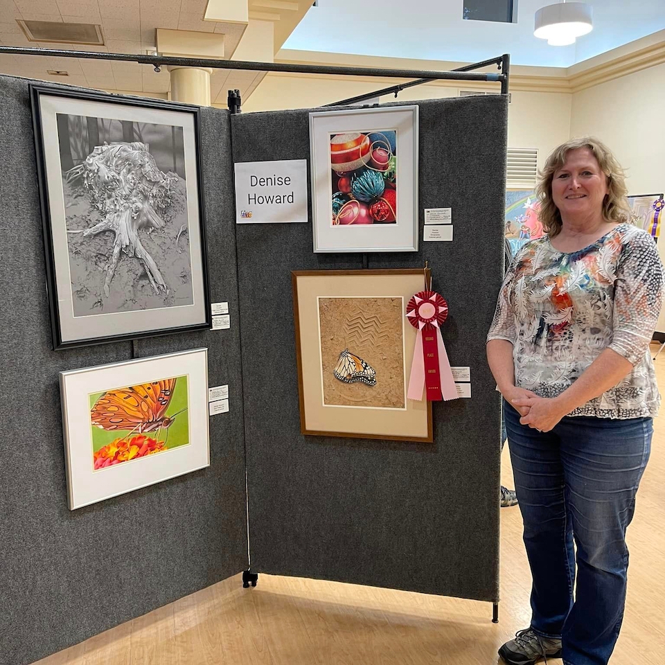
Exhibited work in 14 exhibitions, from local to international, including the prestigious de Young Open in San Francisco
Finished 7 new artworks
Won 8 awards (two 2nd Place, one 3rd Place, Award of Merit, Award of Excellence, three Honorable Mention)
Taught 2 virtual workshops
Taught 3 local in-person workshops
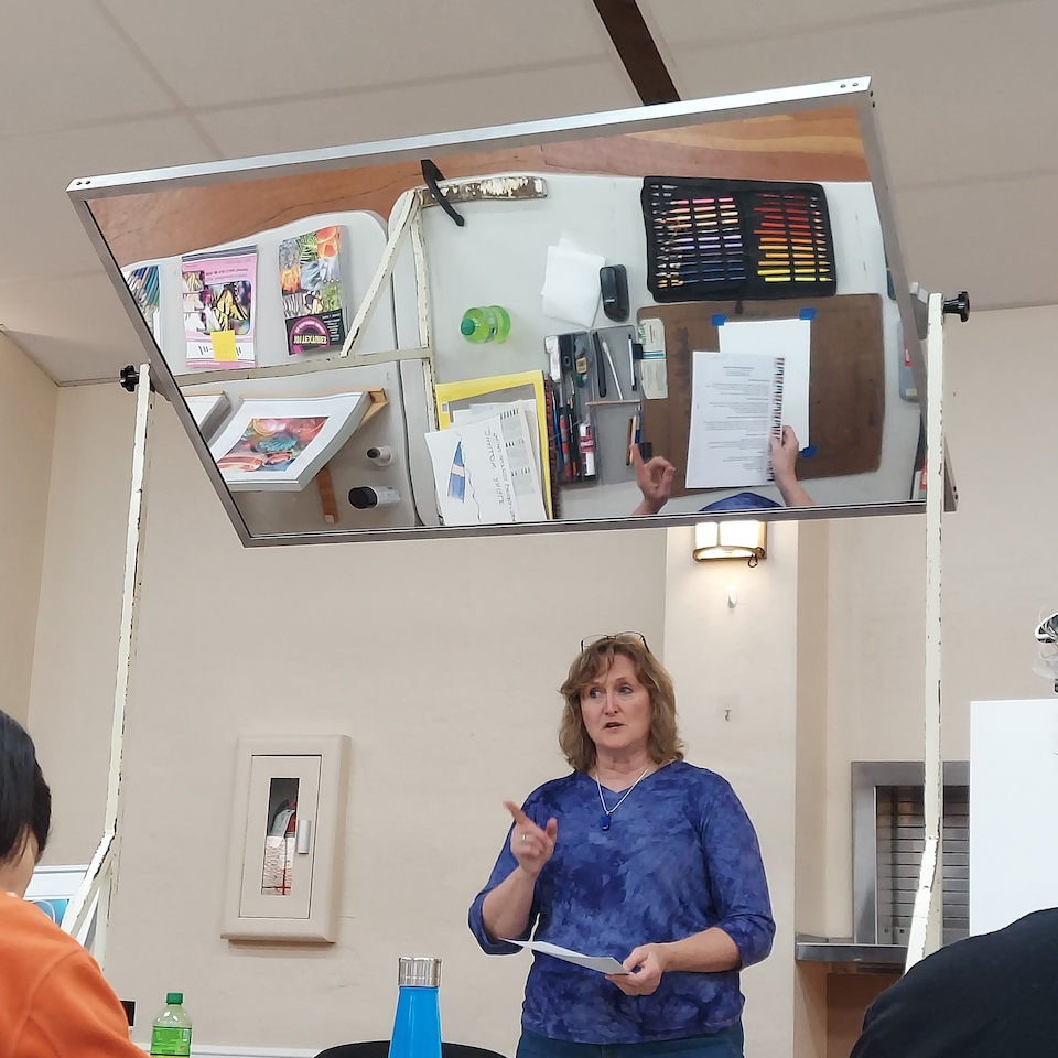
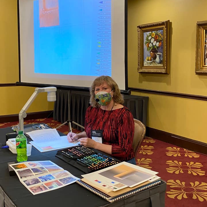
Gave 4 presentations to local art groups
Exhibited 2 weekends in Silicon Valley Open Studios
Finished my first full year as president of the Colored Pencil Society of America
Attended the CPSA convention in Cincinnati
Had a piece chosen for inclusion in the book CP Treasures, Vol. 9
Published an article in the June issue of Ann Kullberg’s COLOR magazine
Published a tutorial in the UK Coloured Pencil Society’s magazine, Talking Point
Finally joined Instagram for my art
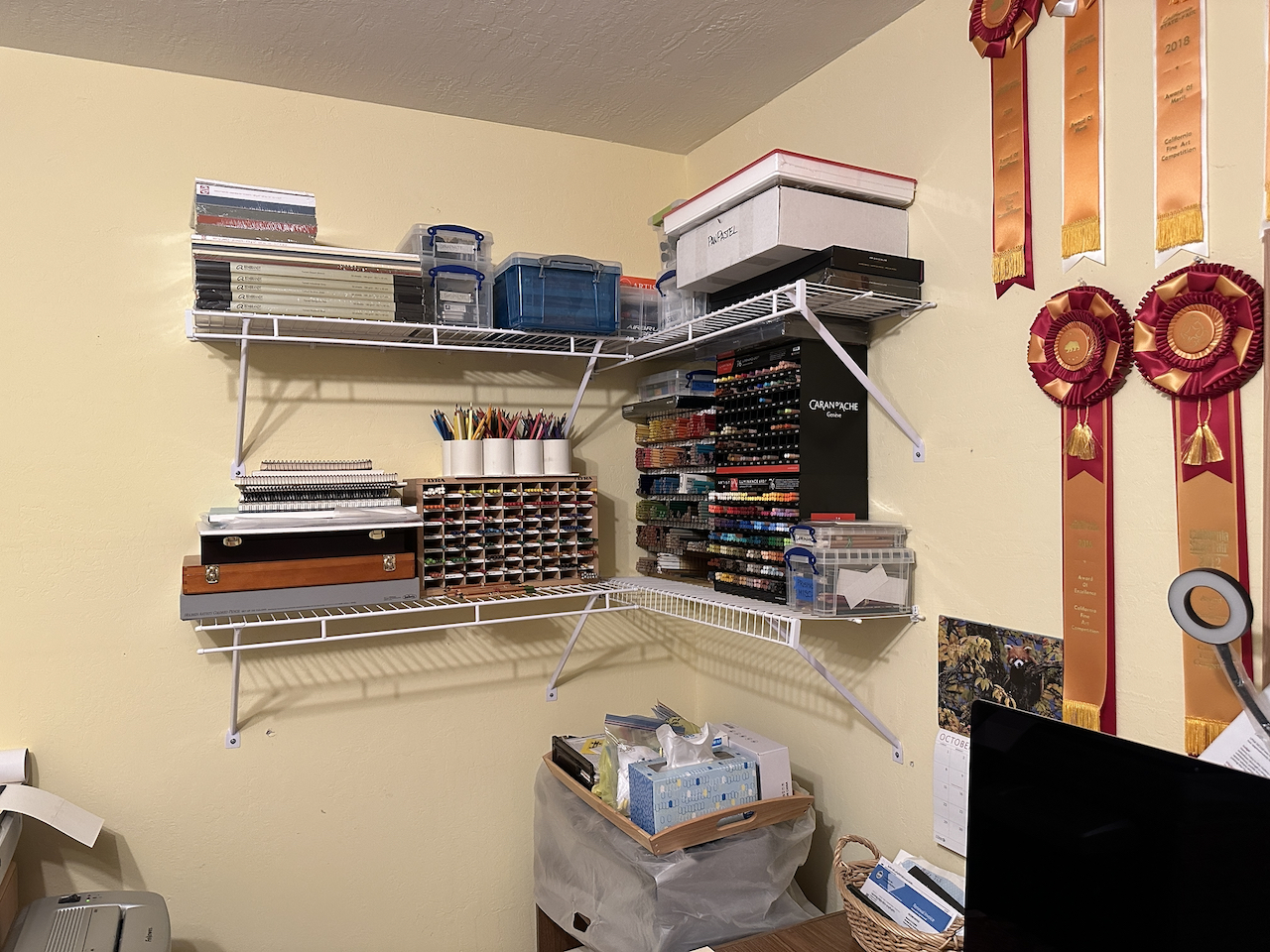
Reorganized my studio and installed shelving
Alas, I didn’t sell any original artworks, and since the rent on my art storage unit increased quite a bit, I finished the year “in the red (art income vs. art expenses).
Non-art-related but just as important:
Continued to avoid COVID
Took my first real vacation in several years: a week in New York City where I visited the Metropolitan Museum of Art, the Guggenheim, MOMA, the Museum of Natural History, the USS Intrepid, the Museum of the American Indian, and saw “The Lion King” on Broadway
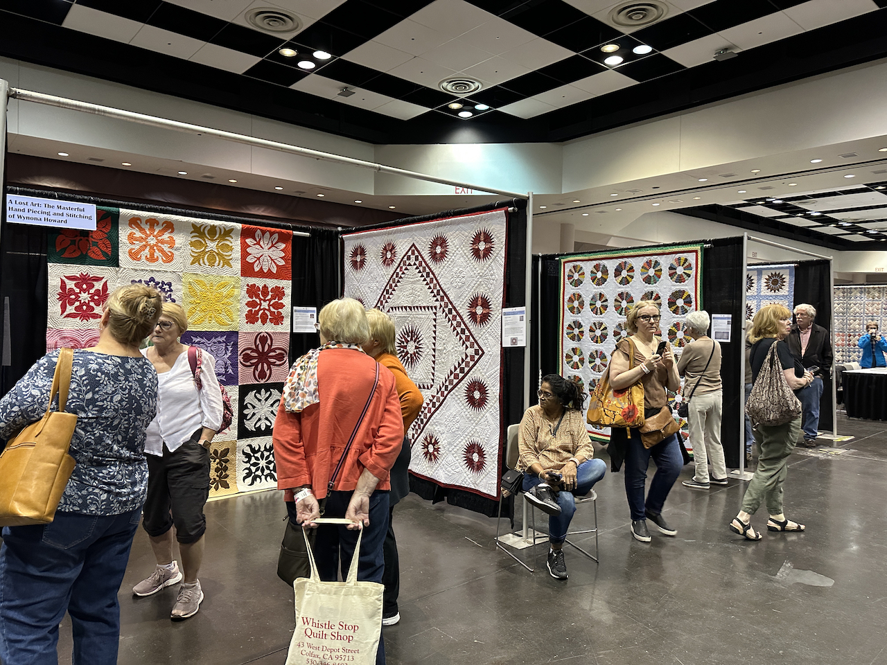
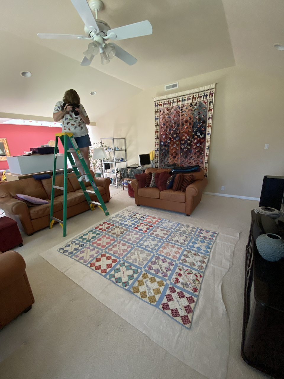
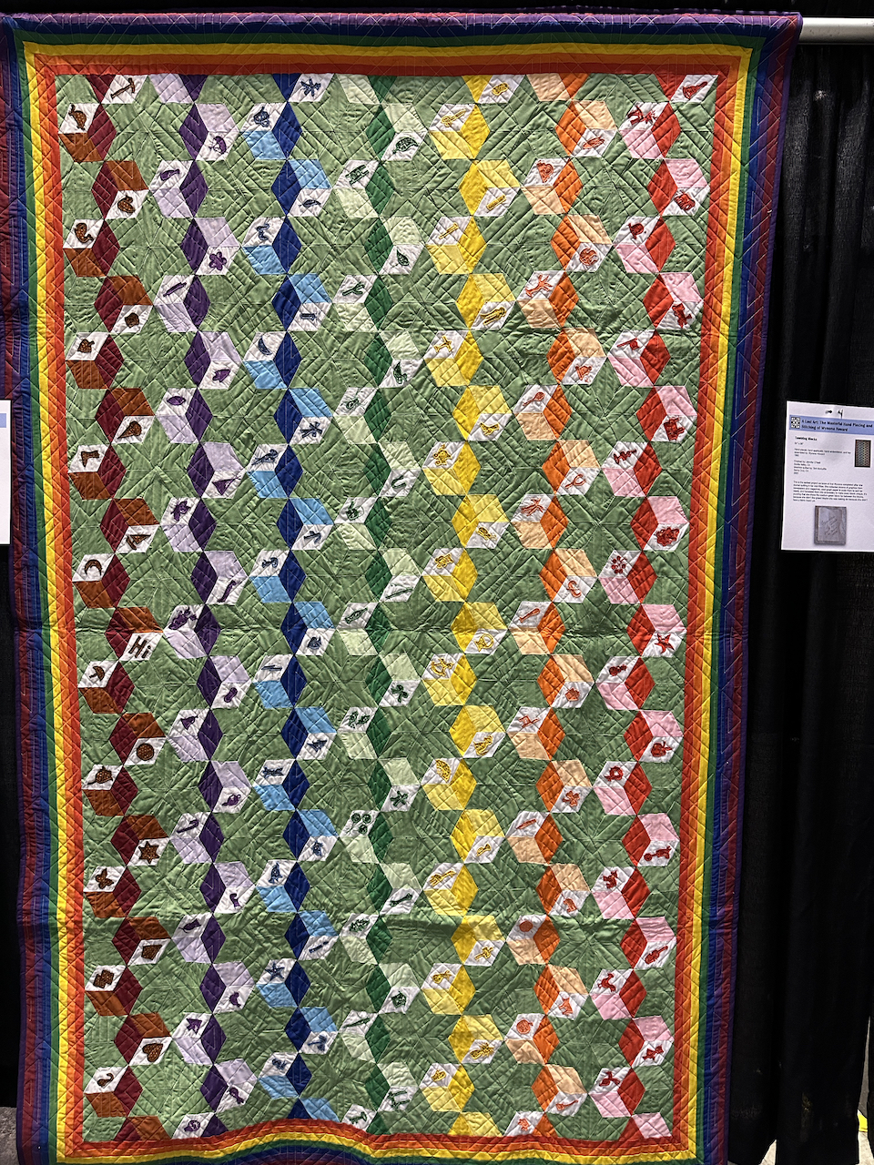
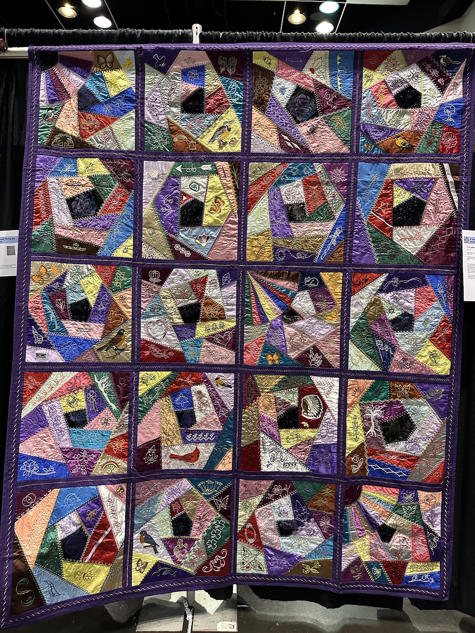
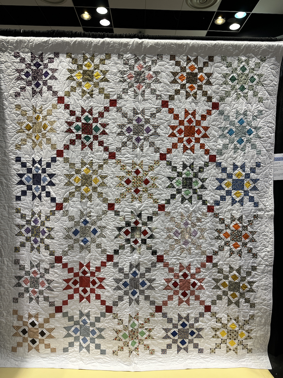
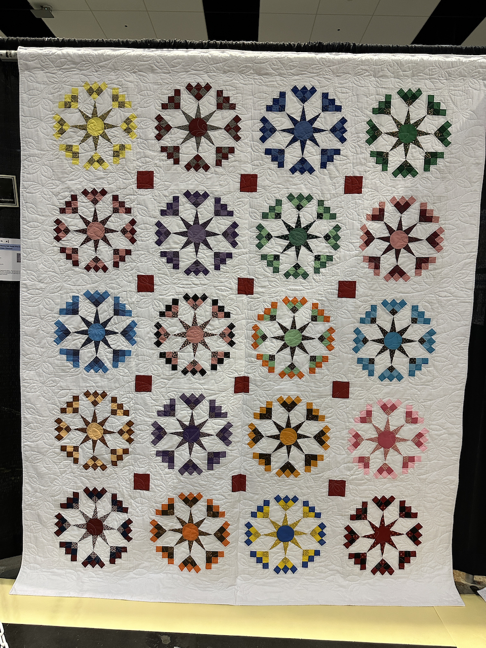
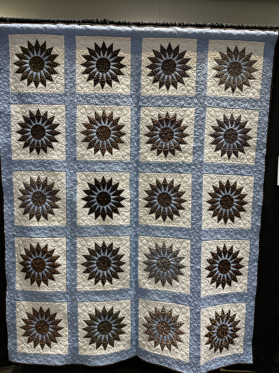
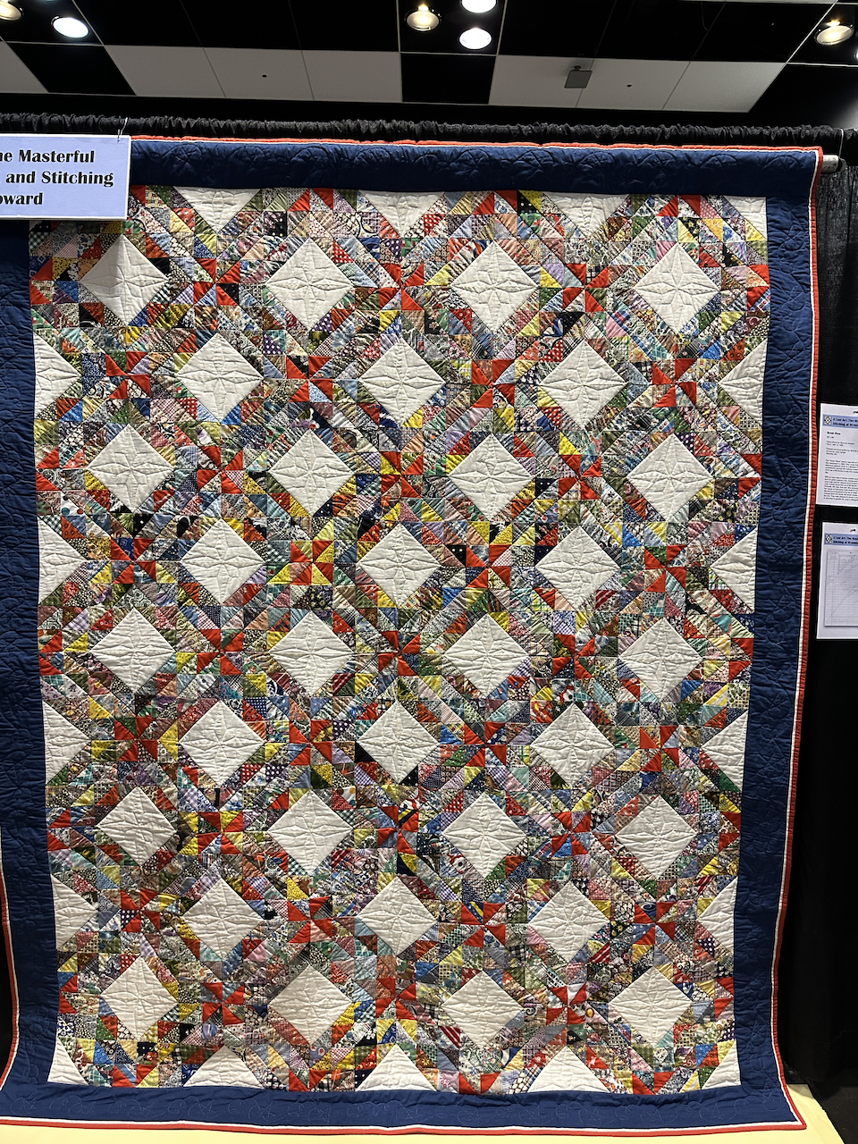
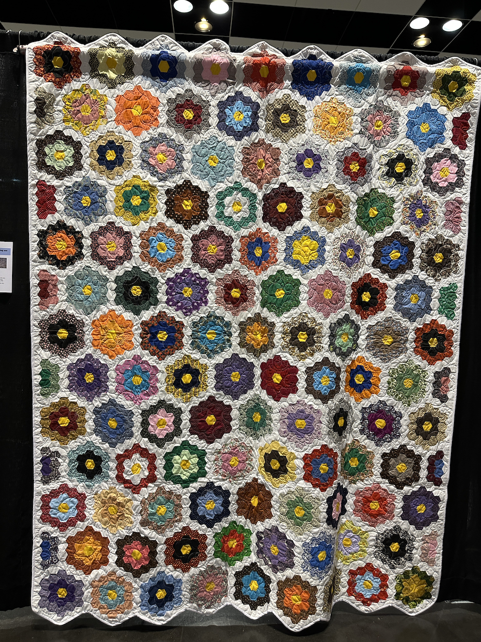
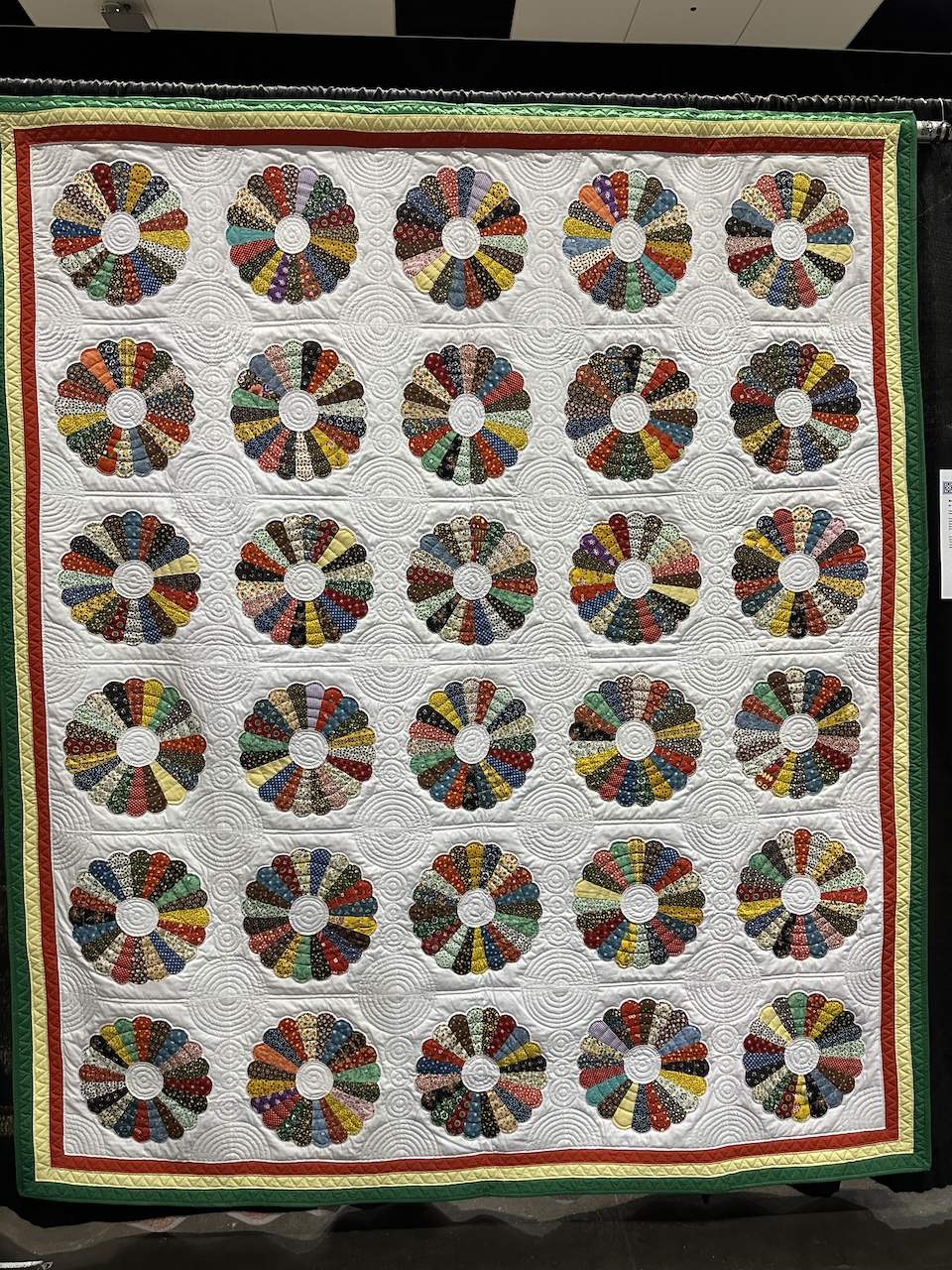
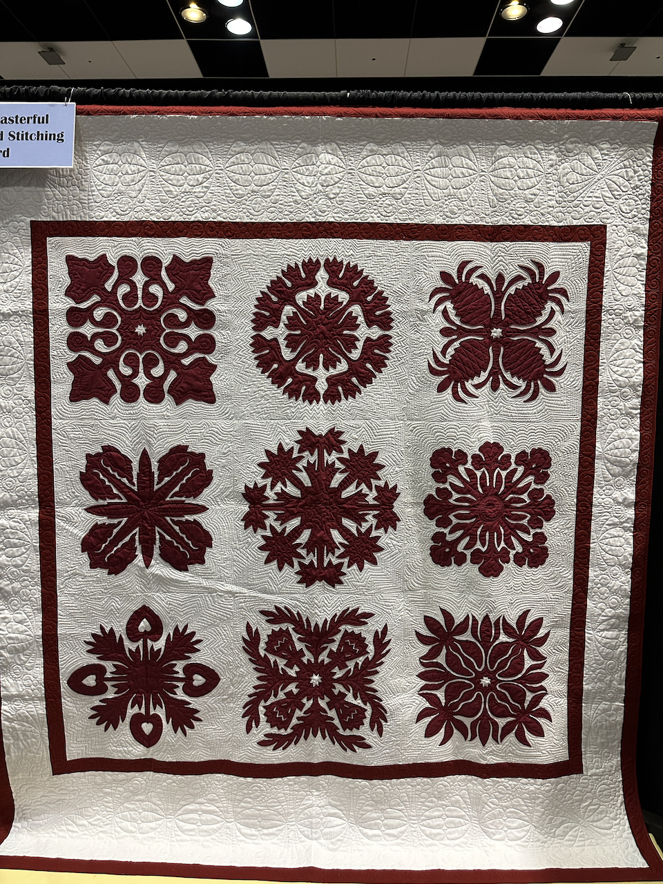
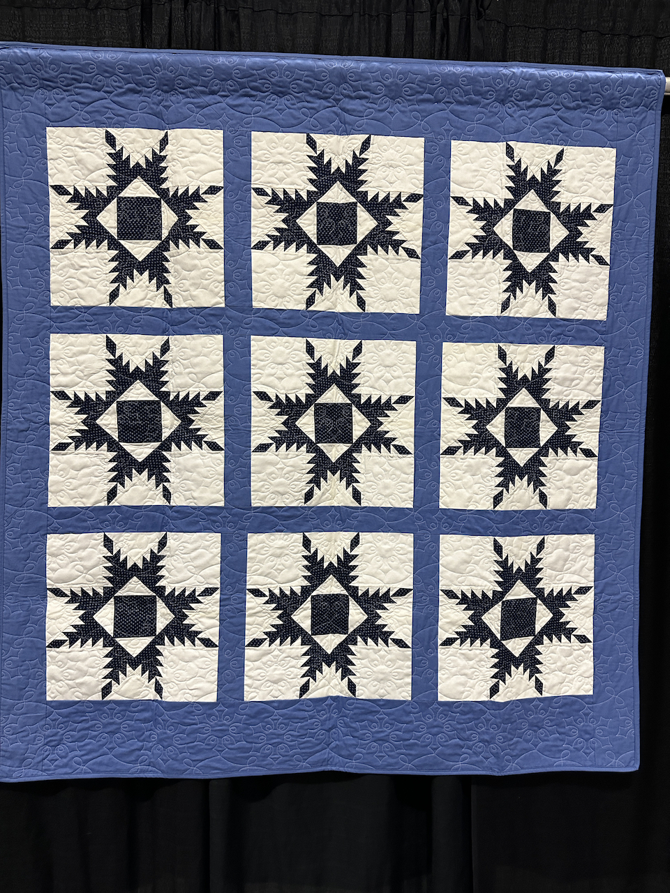
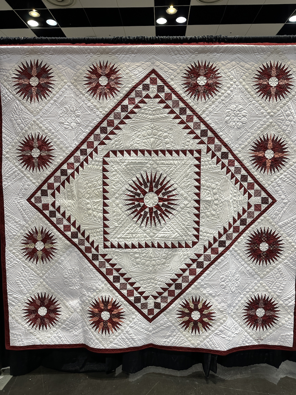
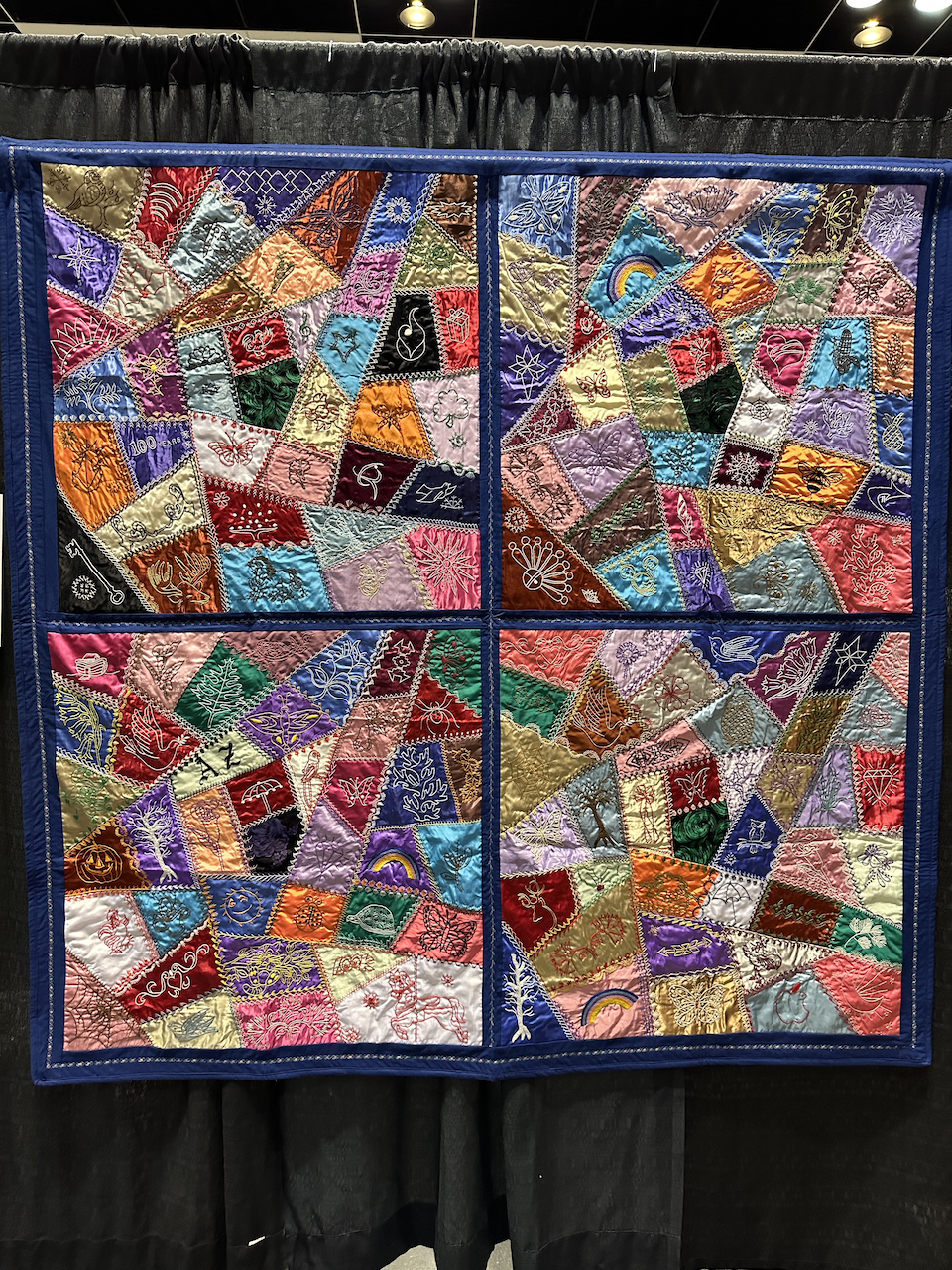
Organized a memorial exhibition of my mother’s lifetime of quilting at the Pacific International Quilt Festival
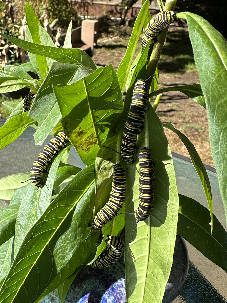
Rescued and raised 20 very late-season monarch caterpillars to adulthood
I didn’t meet my goal of experimenting with some additional media. Being president of the CPSA was sometimes a full-time job, especially in June and July on the run-up to the convention!
So, here comes 2024! I already have three workshops and a presentation scheduled. I’m going to re-commit to experimenting with some additional media (watercolor, acrylic, oil, pastel, airbrush). I’m going to skip Silicon Valley Open Studios so I can teach a two-day workshop in Florida. The CPSA convention will be in Brea, CA, so I’m going to make a vacation out of that by driving down the coast to get there and taking a couple of extra days afterward.
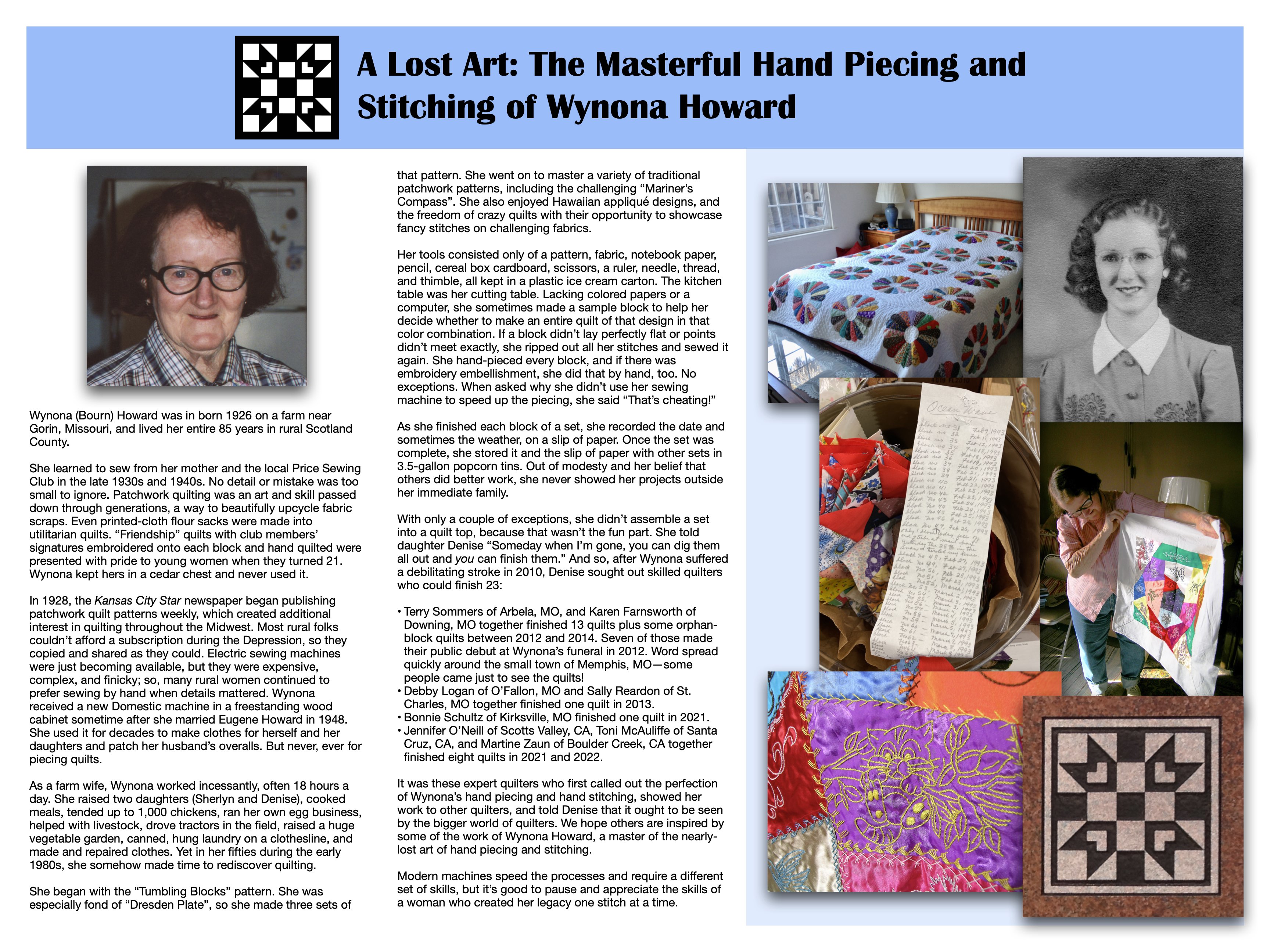
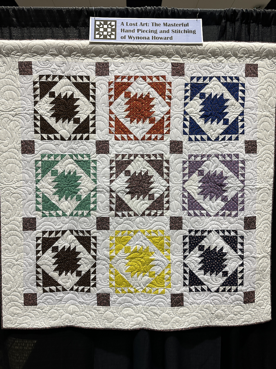
This post isn’t really about me, it’s about my mother, Wynona Howard, who died at age 84 in 2012. She left behind a legacy of almost 30 quilts she’d made, in various states of completion. This is about Mom’s art, but you’ll see the connection to my art as you read on.
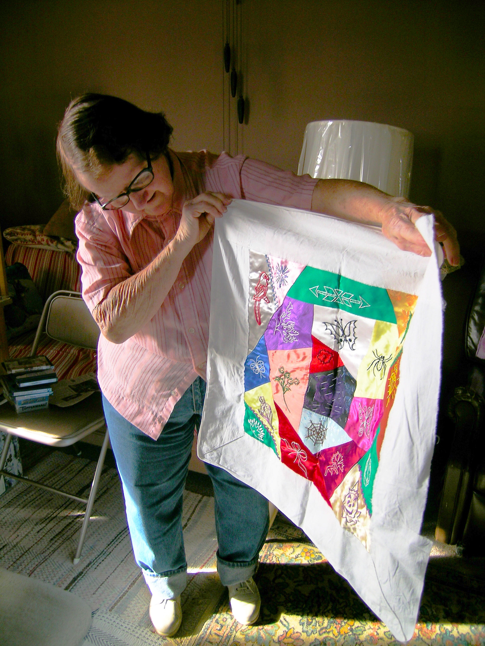
Mom learned to sew from her mother and the Price Sewing Club of rural Gorin, MO in the 1930s and 1940s. But once she married, she was far too busy raising two kids, driving tractors in the field, helping with livestock, raising and tending a thousand laying hens, prepping and selling their eggs, raising a huge vegetable garden, canning, making and patching clothes, and cooking meals to do much of anything for herself. Nonetheless, in her fifties her interest in quilting was rekindled, and she started collecting fabrics and making sets of blocks. Whenever I visited, she pulled out her latest work to show me. I confess I didn’t think much about it at the time; in my mind, it wasn’t “done” if it wasn’t a quilt! More than once, I asked why she didn’t continue and finish the sets into quilts; she said “Oh, someday when I’m gone, you and Sherlyn can pull them all out and you can finish them.” I guess she hoped to spark in me an interest in quilting, but it didn’t because I already had my own art interests.
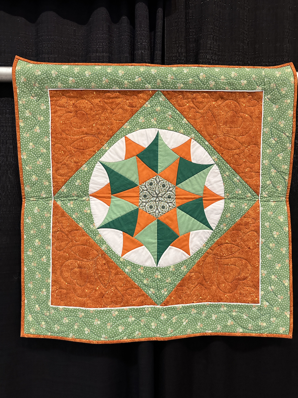
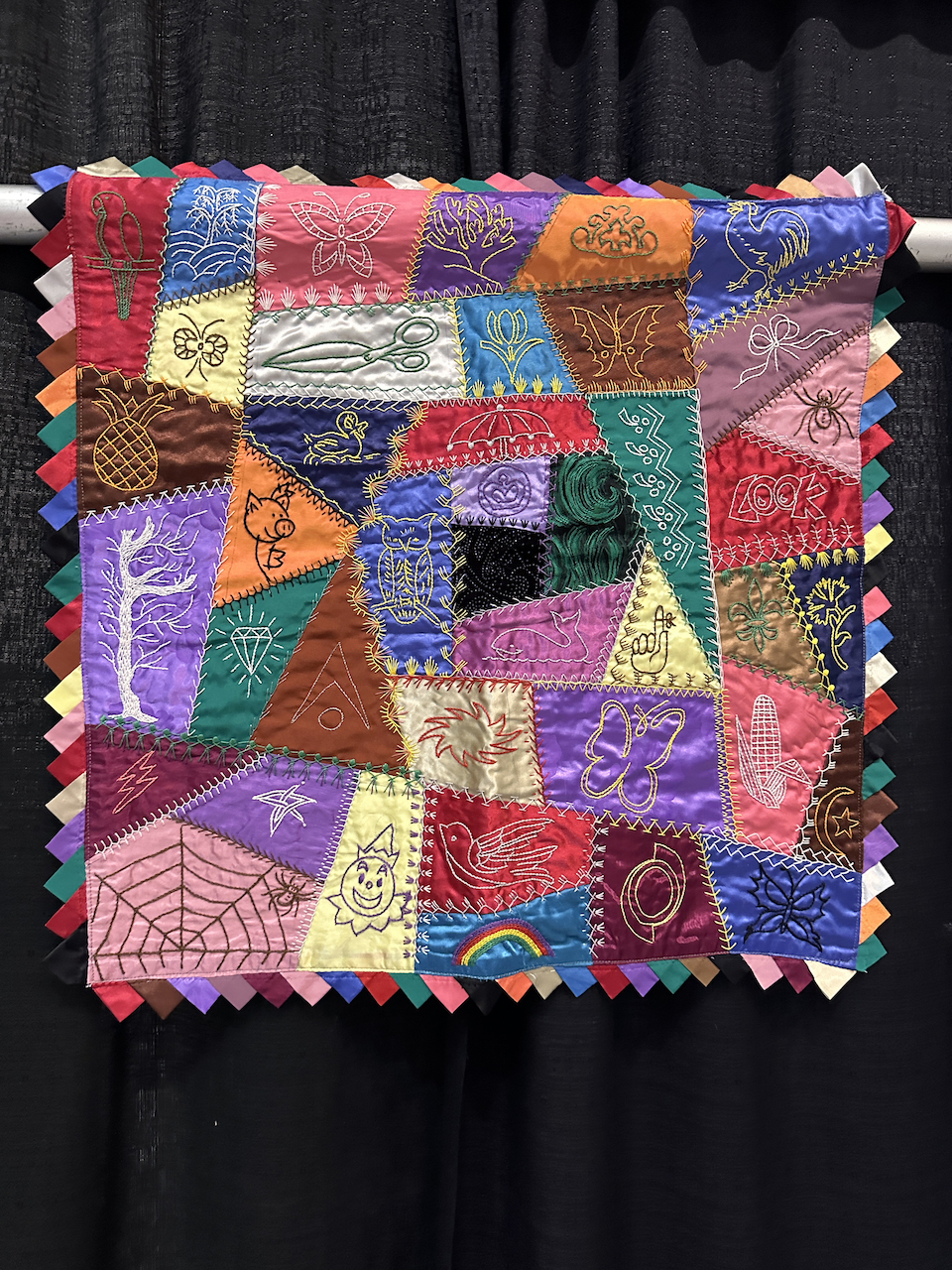
Mom showing off an in-progress crazy quilt block, Christmas 2004
When a catastrophic stroke ended her sewing ability and all ability to communicate in 2010, the time that Mom foretold had come. Over the next several years, I hired multiple women to assemble, machine-quilt and finish all the quilts. It wasn’t until these women independently commented, “Do you realize what perfect hand-stitching your mother did?” and showed me what they meant, that I gained an appreciation for Mom’s artistry and skill. I finally understood where my attention to detail in my art came from! I regret that I didn’t take a stronger interest while Mom was alive, and didn’t ensure that she saw at least one finished so she could hear such praise. Mothers spend their lives praising and encouraging their children’s creative pursuits, but how many children bother to praise and encourage their mothers’?
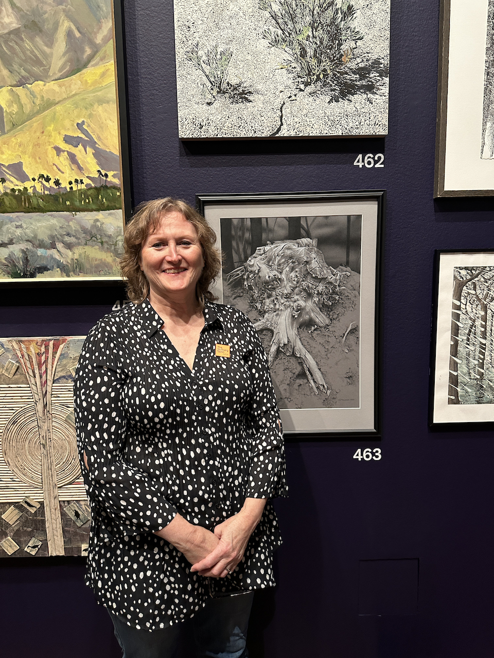
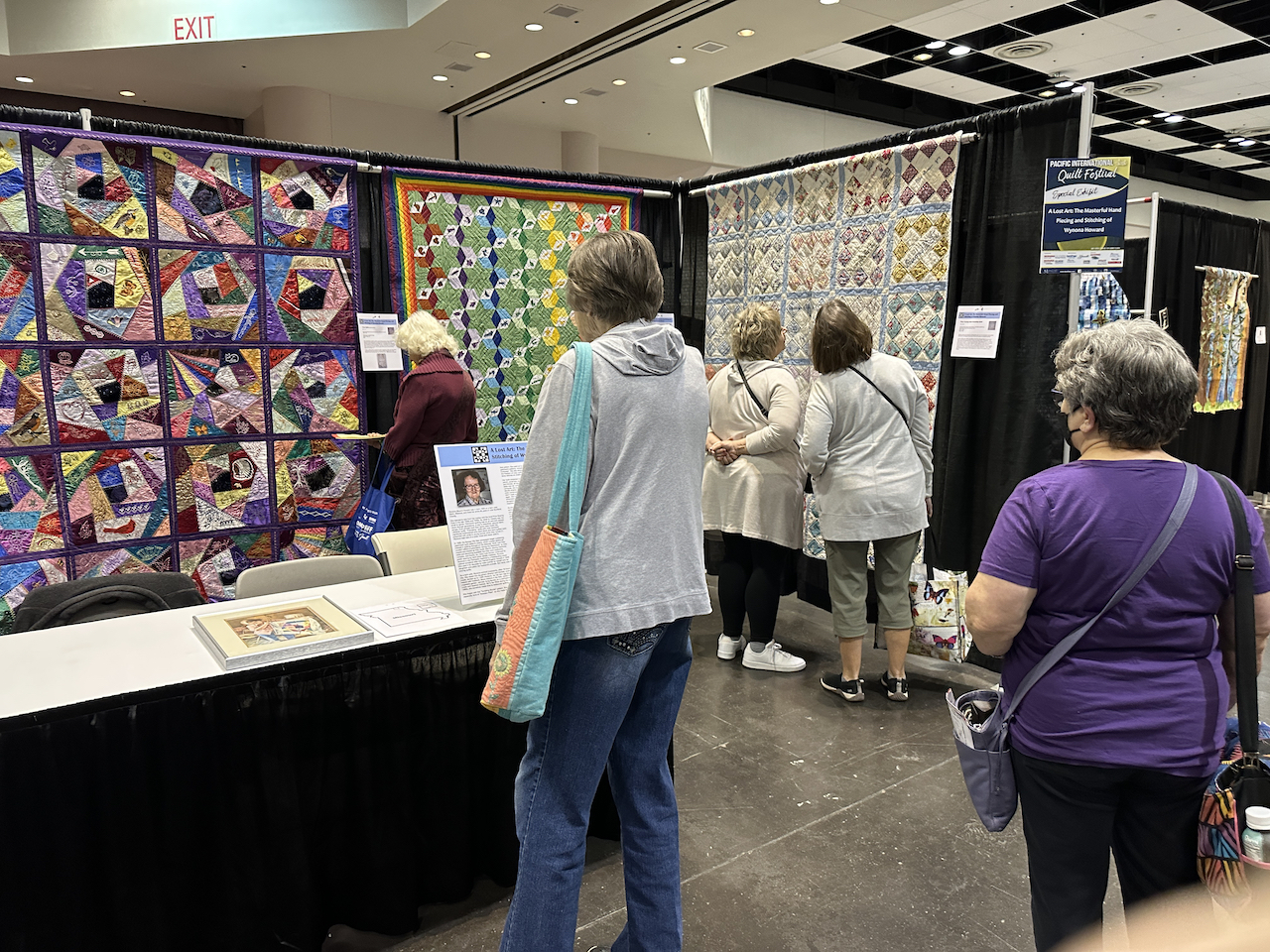
In late 2022 one of these women suggested that I ought to submit a proposal for a special exhibit of Mom’s quilts at the Pacific International Quilt Festival (PIQF) so the quilting public could enjoy them. So I did: “A Lost Art: The Masterful Hand Piecing and Stitching of Wynona Howard” was born, and it was accepted for the PIQF at the Santa Clara Convention Center in Santa Clara, CA, October 12-15, 2023.
The work began in August, and I quickly realized this wasn’t just a bunch of quilts, this was a full-on solo art show. As soon as I realized that, my art school training kicked in! I’d started with a theme and a 75-words-or-less summary, and from there I knew I needed to:
Create a spreadsheet cataloging all the details of every quilt (size, pattern name, date, who did what, etc.)
Photograph every quilt
Select which quilts to include in the exhibit
Determine the order of the quilts
Ensure each quilt had a hanging sleeve
Write and design a statement poster about the exhibit
Write, design, and print descriptive tags for each quilt
Make a banner for each “room” for continuity
Design the poster, banners, and tags for cohesion
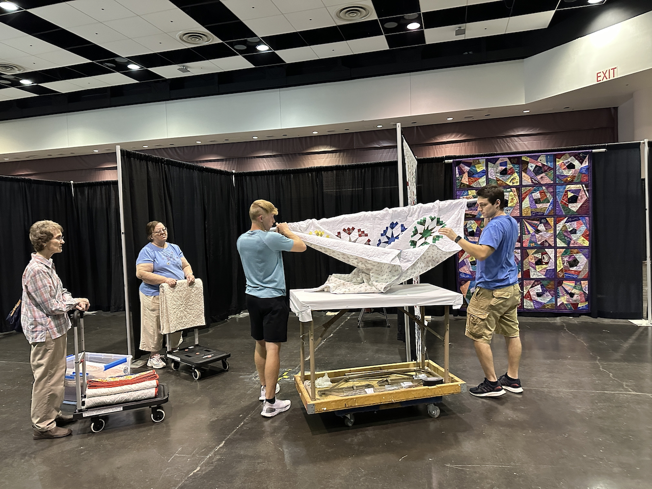
Determine how to safely transport all the quilts and materials
I got a lot of exercise from photographing and measuring all the quilts!
Then at festival time in October I had to:
Transport all the quilts and materials
Work with the organizer to make sure the right amount of space was allotted and a table was provided
Ensure the quilts were hung in the right order
Attach the tags and banners
Set up the statement poster and other information on the table
The statement/poster I wrote, designed and composed for the exhibit. Click to read the full text on it.
I got some good advice from a woman who had mounted a similar exhibit in the 2022 PIQF. She told me she’d wanted that exhibit to look like something you’d find in a museum, and that’s what I wanted for Mom’s, too, so I stayed in touch. I’d taken several photos of that exhibit, and she taught me how to make banner hangers from shower curtain hangers.
I’m grateful that my sister Sherlyn and my best friend Debby both flew in from St. Louis to assist with the festival! Under my direction we had everything set up within 45 minutes, and they sat with me at the exhibit all day each of the four days to answer visitors’ questions. The festival staff were also very responsive and helpful. Thanks to all the preparations I did in August, it all went without a hitch.
It was wonderful to finally see Mom’s quilts get the attention and praise they deserved, in her own solo show, that I organized. She never showed her work outside our immediate family because she was very modest and was sure others’ work was better so she didn’t want to suffer criticism. But I think she’d be proud that, yes, I did get them all finished, and they’ve now been enjoyed by many people, just not any of the people she would ever have imagined.
Setup and show! My sister Sherlyn and I surrounded by Mom’s artThe quilts hanging in the exhibit
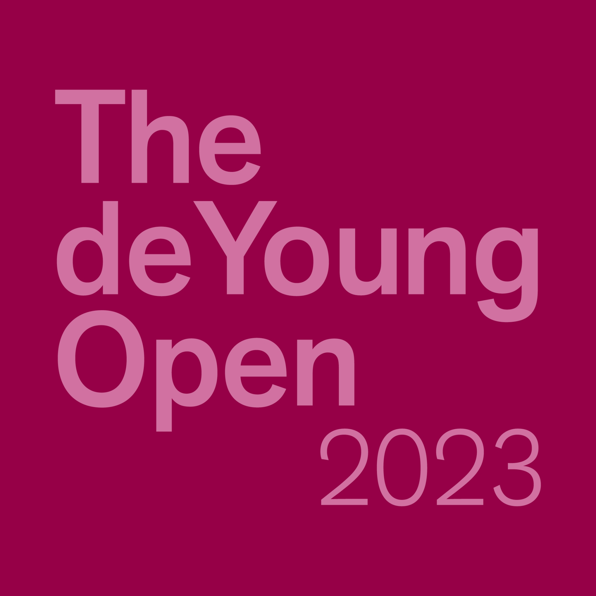
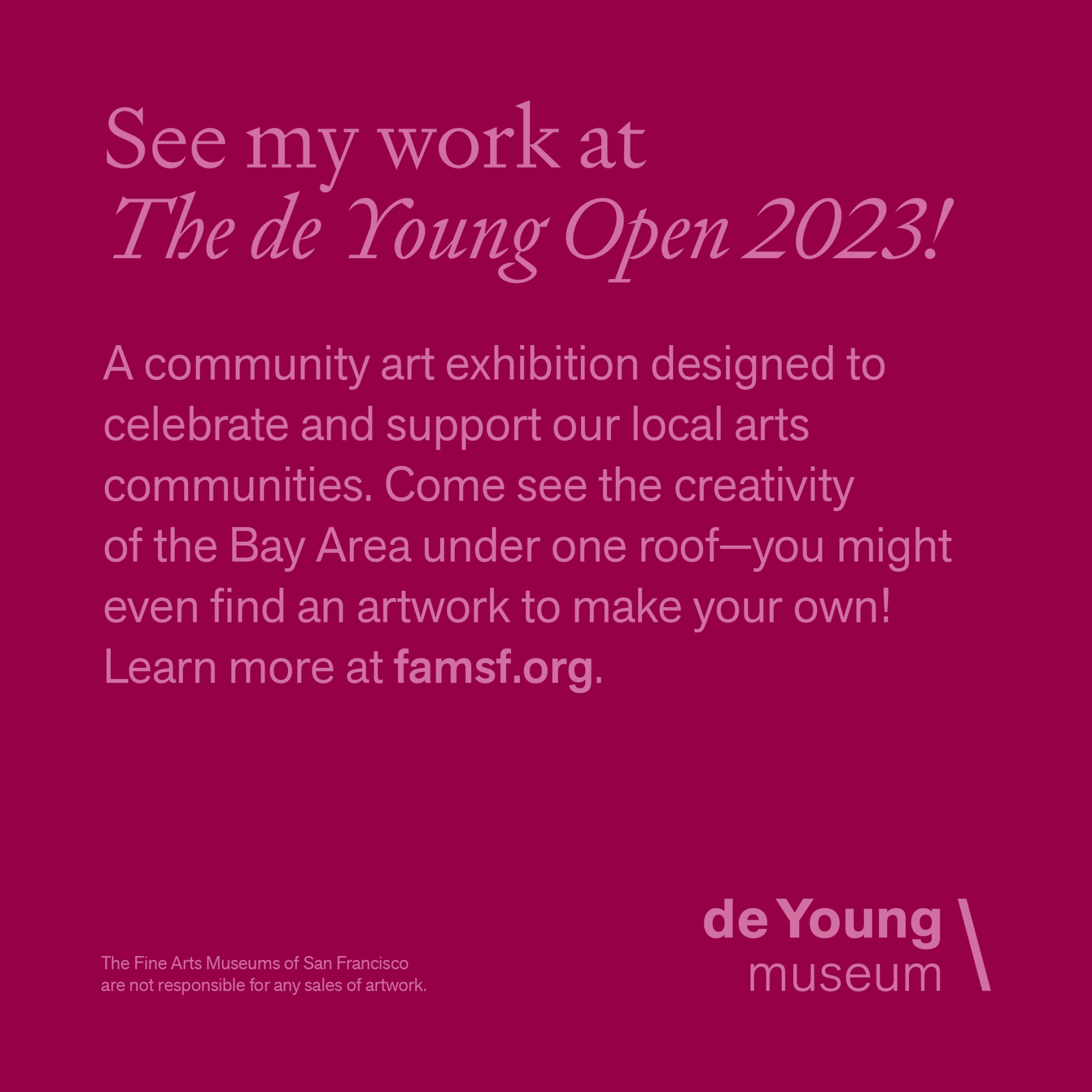
In case you’ve never heard of the de Young Museum of Art, it’s a world-class art museum in San Francisco, in the heart of Golden Gate Park and across a plaza from the California Academy of Sciences. It’s affiliated with the Legion of Honor, which is also a world-class art museum. The de Young’s focuses are on American art from the 17th century to the present, textile arts, African art, Oceanic art, art of the Americas, and international contemporary art.
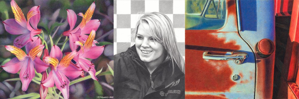
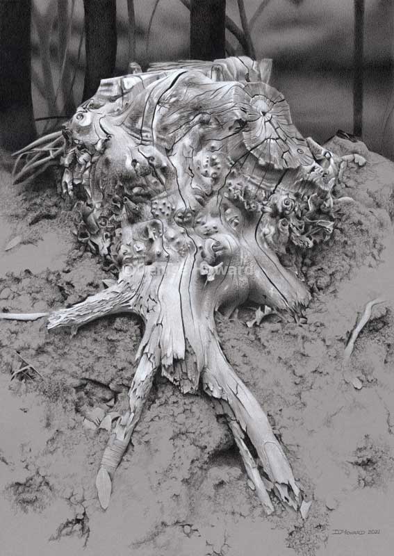
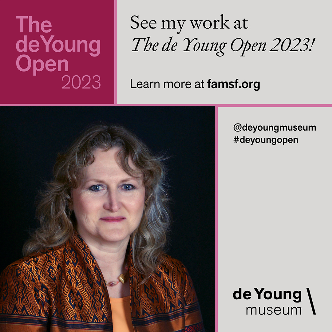
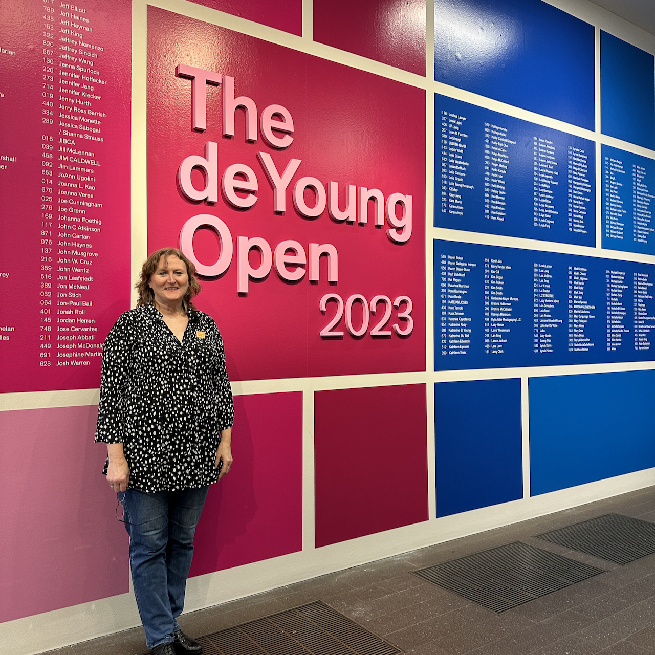
Once every three years, the museum hosts the de Young Open, which is open to artists in all media in the nine counties comprising the San Francisco Bay Area. There’s no entry fee. Each artist can submit just one piece. They receive thousands and thousands of entries, from which only about 10% are chosen. To say it’s a big deal is an understatement. With an “Oh why not, you won’t get in if you don’t enter” attitude, I submitted my “All That I Once Was Is Lost” on June 6.
“All That I Once Was Is Lost”
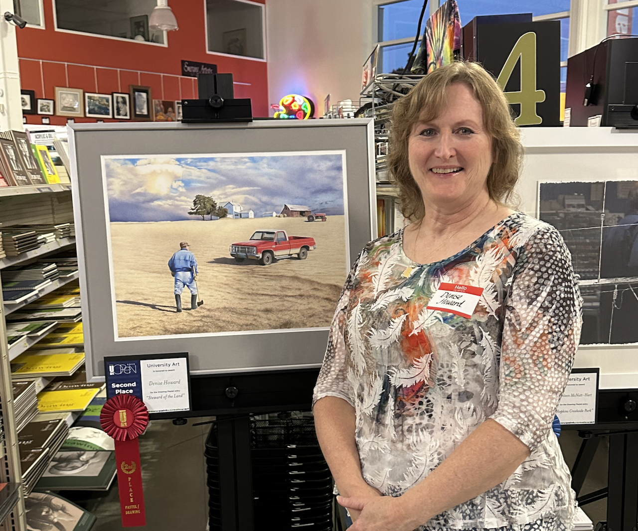
On August 14, I got an email with the subject “Results for Your Submission to “The de Young Open 2023″”. I took a deep breath before I clicked on it. “All That I Once Was Is Lost” was selected! There were 7766 entries, and mine was one of the 883 chosen. I bounced up and down in my chair as I read the email over and over to make sure I’d read it correctly. At the time, “All That I Once Was Is Lost” was already on display in the Triton Museum of Art in Santa Clara in their annual Salon at the Triton statewide 2-D competition, in which it won 3rd Place in Drawing. (For that show, there were over 1700 entries, from which 141 were selected, so that was already exciting!)
I was impressed with the information the de Young provided in the email: links to a map and very clear instructions on how, where, and when to deliver my artwork, a FAQ, and even a link to a social media toolkit to help artists promote the exhibit and their achievement.
On delivery day, September 6, I was a little apprehensive since driving in San Francisco is never fun and parking can be a problem. But I was in and out of the de Young in fifteen minutes, so quickly that I didn’t even have to pay for parking in the underground garage. The receiving staff was cheery and efficient and I could tell they would take good care of my artwork.
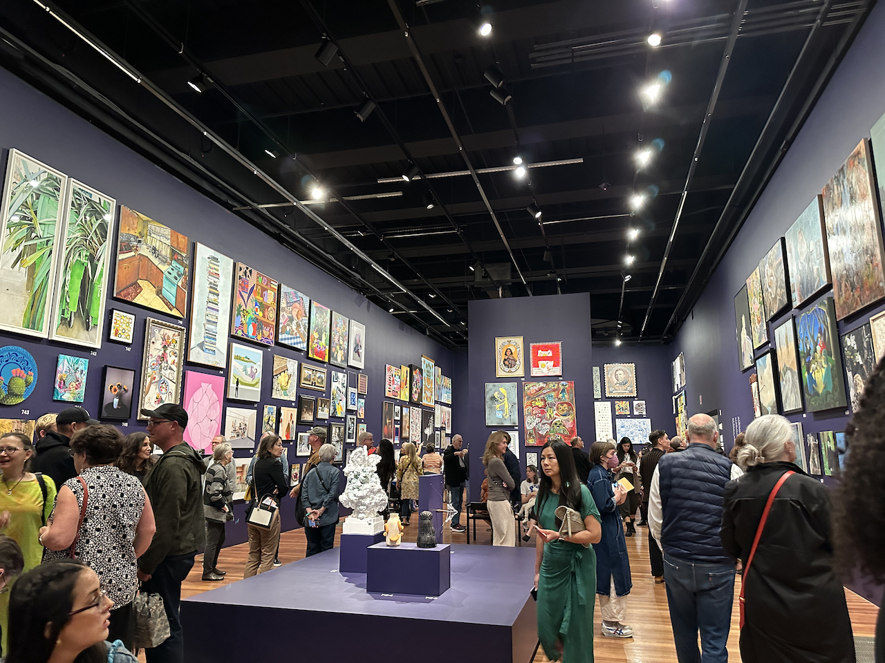
On September 26, the de Young held a private “artist preview day” just for the accepted artists, before the official opening of the exhibit on September 30. Wild horses couldn’t have kept me away! The whole place was abuzz with the hundreds of excited artists. Complete strangers congratulated each other and offered to take photos in front of the big, colorful entrance wall that listed all our names in vinyl lettering. As we filed in and our names were checked off the RSVP list, we were congratulated and given a well-made enameled pin to wear that declared “The deYoung Open Artist.” And every exhibiting artist received a free one-year membership to the de Young.
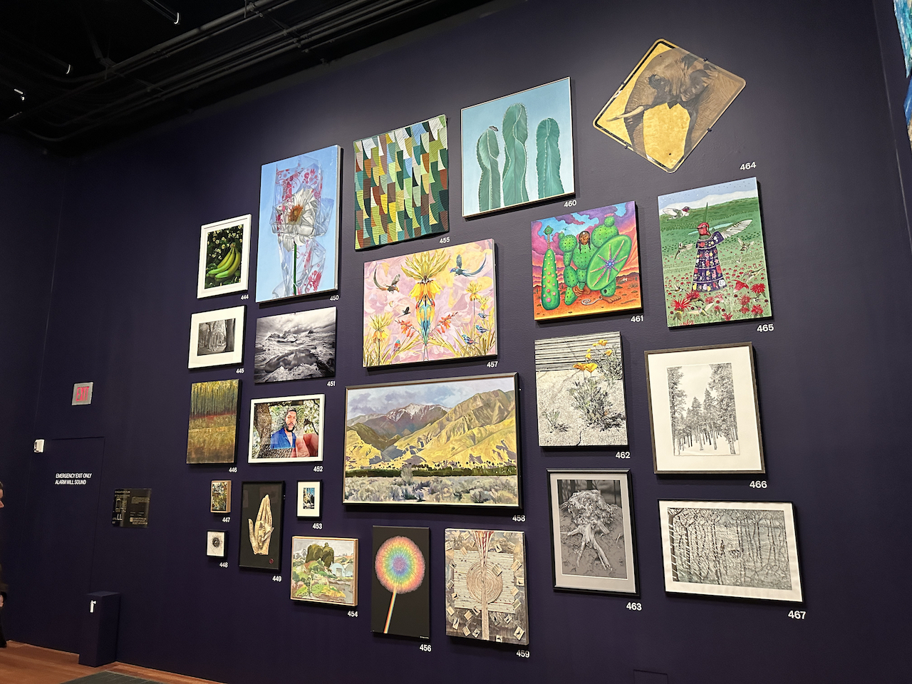
Over the next 2.5 hours, I made four passes through the entire exhibit. The first pass was overwhelming! Eight high-ceilinged rooms filled with art nearly from floor to ceiling (i.e., salon style) and packed with the artists who made it all. I bumped into three artists I know, and saw works by a couple of other artists I know. On the second pass I figured out that each “room” had a different theme (cityscape, portrait/figure, nature, abstract, etc.) and noticed that each room’s entrance had a “key” to the artists and artwork titles in it. On the third pass I noticed that the wall color throughout is not black but a deep indigo, which works well to show off all the art, and that every piece is somehow perfectly lit. On the fourth pass, I marveled at how the museum staff managed to arrange the hundreds of artworks to fit together. They must’ve used some kind of software to do that, based on the framed dimensions that we’d all provided with our entries. And I marveled at what a job it must’ve been to hang them all, especially the larger pieces up high. On every pass I noticed artworks I’d missed on previous passes–there was always more to take in.
Conversations between artists started with an exchange of “Congratulations!” and went on to topics like “How on earth did you get that here–did you have to rent a big truck?” and “What media did you use for this?” and “Where did you find this scene?” and “Tell me about your inspiration for this”, and “Show me which piece is yours?”
At the end of the day, I was tired and exhilarated, and it occurred to me that this is the difference between exhibiting in small shows vs. a world-class museum: the amount of planning and organization they can do with a large, professional staff that handles a spectrum of specialties and responsibilities, the facilities and materials they have, and the available budget they have to work with.
It reminded me of my first visit to Disneyland at age 49. Throughout my life, I’ve been to quite a few amusement parks, and I always thought “What’s the big deal about Disneyland? It’s just another amusement park.” And then when I finally visited it, I thought “Now I get it–all the other amusement parks aspire to be Disneyland!”
This is not to belittle smaller venues or local art club shows at all! They all accomplish remarkable things with the people, facilities, and budgets they have. I’m simply very grateful that I got to experience what it’s like to work with a world-class museum in my lifetime. Another personal art goal met!
The de Young Open will be on display through January 7, 2024. Go see it–the artworks on display are amazing! If you can’t make it, the entire exhibition is online here.
UPDATE 10/23: Last week I took my sister who was visiting from St. Louis to see the exhibit. I wore my special exhibit pin for fun. At the ticket counter I presented my new membership card, and to my surprise, both of us got in for free and the gentleman said “I see you’re one of our artists–congratulations again!” Isn’t it a delight to receive recognition like that in front of a family member? I hope all my fellow artists get that opportunity.
I’ve been following with great interest—and some worry—all the latest developments around artificial intelligence (AI) applications. After all, I took an elective class on AI in grad school decades ago. ChatGPT and Bing are being used to write news articles, college essays, resumes, and speeches. Midjourney and DALL-E are being used to generate imagery. These are only the best-known; they have many competitors, all racing to achieve the holy grail of producing results that are indistinguishable from the best human efforts.
Such disruptive high-tech innovation seems so distant from us artists working in traditional media, but I’ve already been personally affected by it:
The de Young Museum in San Francisco holds a very competitive triennial (every three years) exhibition open to artists in all media in the nine Bay Area counties. For 2023, they added a category for AI-generated art. This caused quite a stir in the Bay Area art community; many artists are against AI being acknowledged as an art medium. Some suggested they would boycott by not entering. But that wouldn’t help, it just means the traditional artists who don’t enter would get less public exposure and the AI artists who do enter would get more.
The Triton Museum of Art in Santa Clara, CA holds a statewide 2D competition annually. For 2023, a clause was added to the prospectus forbidding AI-generated art to be included in any way, with the threat of having the art removed from the show if it was discovered the artist used AI. They were praised by many artists for taking a stand against it.
These two stands on generative AI couldn’t be much further apart! And then there was the demo artist at the monthly meeting of a local art club I attended: his introduction that was read aloud was really something, gushing about him and his work, and it didn’t sound like something he could’ve written. He confessed later that he had an AI write it.
Those who support the use of generative AI for imagery like to point out that photography wasn’t accepted as an art medium for a long time, and the art world finally came around. I assert that photography is different: a camera, directly manipulated by the photographer, captures the world through a lens. AI creates a scene that doesn’t exist at all. What the best fantasy and visual effects artists conjure with a lot of imagination, skill, and hours of labor, an AI does in seconds from a few prompts based on the deep knowledge of imagery it’s been trained on. If you really want to compare photography to generative AI, it’s more like asking a skilled photographer to take a photo for you based on a few basic instructions and then taking credit for it. But the result is still their photo, not yours!
With an AI, anyone with no art skills whatsoever can toss out a few phrases and get back an image that could be mistaken for a master’s. And they take credit for it, even though they didn’t create it. How is a professional artist supposed to feel about that?
And then there’s the issue of how these AIs are “trained”. They are given volumes of images by every artist, sculptor, photographer, etc. so that one can ask for, say, “a painting in the style of Edward Hopper.” The “trainers” did not ask permission from any of the artists to do this. And there is a potential copyright issue around the creation of derivative work.
The whole thing is truly a Pandora’s box. It’s going to make the next several years “interesting.” I know I’m not going to convince anyone who likes the idea of using AI to generate imagery and passing it off as their own that it’s wrong.
If you haven’t guessed by now, here’s how I feel about it all: as a retired software engineer I admire the research and work that has gone into the breakthrough technology, but as an artist I think a lot more thought and discussion needs to happen before it’s granted wide acceptance. Probably even the passage of a few laws. Sadly, I think the horse has already left the barn.
Remember blogs? They used to be a thing. Anyone could start a blog and write about anything. Some were educational, some were humorous, some were blather. They might collect followers, or not. Blogs lost some of their popularity when smart phones gained the ability to make video clips and people started vlogs instead, then YouTube channels with episodes, complete with subscriptions and commercials. Attention spans got shorter, so TikTok replaced a lot of vlogs, and emojis replaced a lot of text.
I started this blog several years ago as a place to share with the world my experiences restarting my art career–things I’m learning along the way about materials, techniques, human nature, etc., in case some tidbits might be useful or interesting to other artists finding their way. I never really know if anyone reads it, and that’s okay.
But twice, now, it has benefited me in unexpected ways! The first time was in late 2016 when an editor for Walter Foster Publishing was looking for an author to write a book they had in mind for their “101 Textures” series, 101 Textures in Colored Pencil. I don’t know how she stumbled across my name in the first place, but when she emailed me she said they’d seen my website so they knew I could draw, and they’d seen my blog so they knew I could write. And that turned into an opportunity that changed my life!
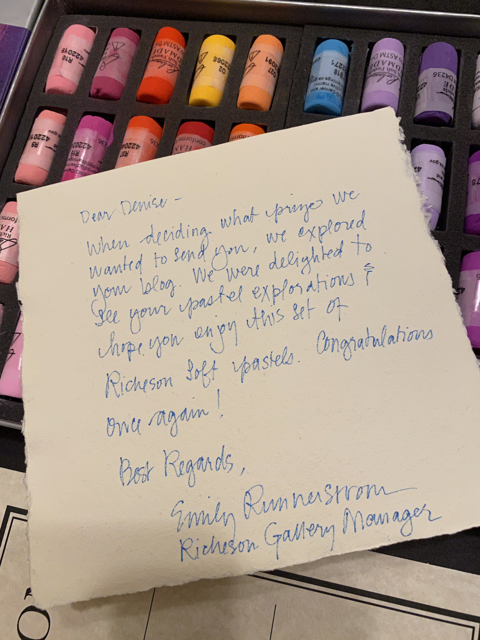
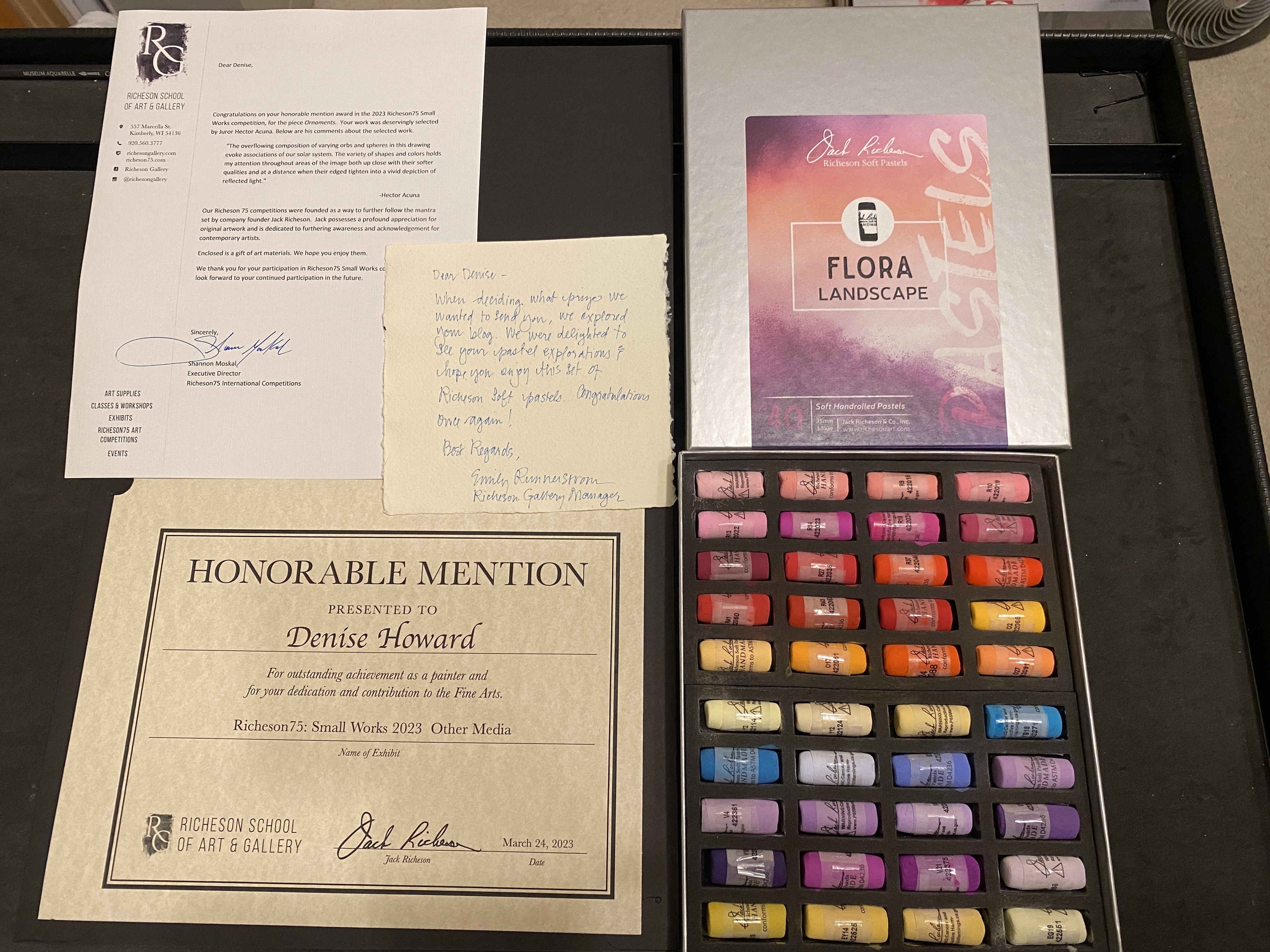
The second time came to my attention just today. I’ve known for several weeks that my Ornaments received an Honorable Mention in the Richeson 75 Small Works 2023 exhibition. What I didn’t know was that Richeson awards prizes even for honorable mentions. Today a package arrived in the mail containing a very nice certificate in a folder, a personal letter, a box of 40 luscious Richeson hand-rolled soft pastels, and a handwritten note from the gallery manager:
“When deciding what prize we wanted to send you, we explored your blog. We were delighted to see your pastel explorations and hope you enjoy this set of Richeson soft pastels. Congratulations once again!”
Any artist who has ever worked with charcoal, graphite, or certain kinds of colored pencils on paper has experienced the heartbreak of smudges. Either the pigment gets on the heel of your hand while you’re working in one area and you don’t notice until there it is in a bad area, or a tiny amount of something else on your skin–dirt, oils, crumbs–directly affects the paper. You may or may not be able to fix it! Normally this can be prevented by keeping a sheet of paper like glassine under your drawing hand at all times.
A couple of months ago I was working on a drawing using Faber-Castell Polychromos pencils on Fabriano Artistico hot-pressed watercolor paper. This combination is a popular one for some artists working in colored pencil. It’s not my most favorite combo, but sometimes it’s the right one for a given project. However, this time it was giving me a big problem.
Despite keeping a sheet of glassine under my drawing hand, and despite always lifting it to move it rather than scooting it across the surface, the glassine–which normally is too slippery to pick up pigment–was nonetheless grabbing pigment and smudging it. I repeatedly had to stop and clean pigment off the surface of the glassine. Polychromos are drier and more powdery than some other brands, which does make them easier to smudge, but this was ridiculous! I found myself resorting to holding my drawing hand above the paper with my other hand. This wasn’t sustainable–it led to cramps in my shoulder and neck muscles. What to do?
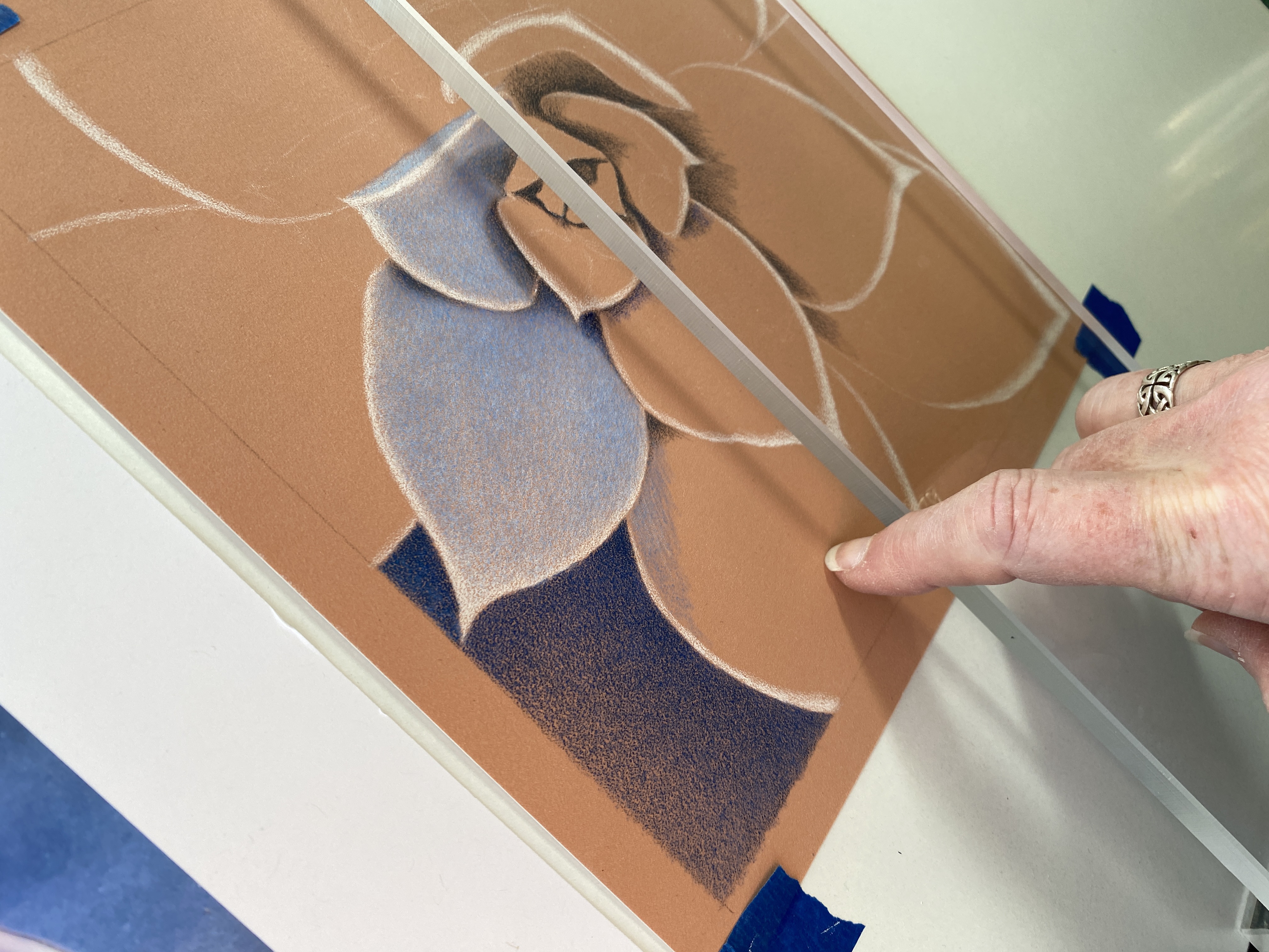
Then I saw an ad for something called a “leaning bridge”–a long strip with very short legs for use on a flat or inclined surface. It’s a very similar idea to the “mahl stick” used by painters who work at an upright easel. One doesn’t really lean weight on it, it’s simply a place to rest and steady the hand. I was intrigued, but I balked at the price–over $50–and the height of the legs seemed too high to me because it was clearly designed more for someone holding paint brushes, maybe a watercolorist.
I’m fortunate to live near a TAP Plastics, so I took a picture of the thing to them and described what I wanted. The knowledgeable staff helped me choose the thickness and width of acrylic so that the strip wouldn’t sag under my hand. I told them how long to make it and how much clearance I wanted under it. The assistant manager came over to see what we were talking about and said “Wow, I wish I’d known about something like this when I was in art school!” Two days later, it was ready. For only about $30, they not only made it to my exact specs, they glued it together seamlessly and smoothed all the edges.
You might say “Why spend $30+ having this “leaning bridge” made out of acrylic when you could just glue together three pieces of wood, or three pieces of foam board?” It’s because 1) neither of those are as smooth as acrylic, 2) neither of those is transparent so that I can see everything under it, 3) wood would be too heavy at the size I wanted, and 4) foam board would have to be too thick to be stiff enough not to sag, which combined with the gap underneath would keep my hand too far from the surface.
I put it to use right away, and from the first minute, it’s been a total game-changer! I wish I’d had this thing years ago. It has made drawing easier by simply ensuring my hand is never in contact with the surface, with or without a sheet of glassine. I don’t have to spend any time being careful. It rests against the pencil ledge at the base of my drawing table and I slide it left and right as needed. It’s long enough to straddle paper of the largest size I work, with a little extra room. And it’s just high enough to provide a bit of gap even if I draw on a hard panel rather than paper.
Every artist who works at a table should have one of these!
Update 4/14/2023: Several people have told me I should make and market these. There are already commercially-available ones; for me it was a matter of their price and height from the surface. I did look into having a test run of them made by TAP Plastics, but the price break on a small quantity was so small I would go in the hole by the time I bought shipping boxes. So, here are the specs so you can have your own made by whatever local company is available to you.
It’s 3/8” thick acrylic, 22.75” long, 4” wide. The two legs are the same 3/8” thick acrylic, 1/2” long, 4” wide. The legs are glued *under* the ends of the big piece to provide 1/2” clearance underneath. Make sure to buff all the cut edges and bevel/round the bottoms of the legs so they won’t ever accidentally crease or cut the paper. This size is large enough to straddle a 21” sheet of paper with room to spare; if you don’t expect to ever work that large, you can specify a different length, just make sure to build some spare into it so it won’t ever sit on your paper.
In my very first programming class (FORTRAN) as a freshman in college, the instructor, Mr. Norman, had each of the 25+ students quickly state their name and their major, because he knew that some students were taking it as an elective or out of curiosity and he wanted to gauge his audience for the semester. When my turn came, I said “Art and computer science”. The next student was halfway through his when Mr. Norman interrupted “Whoa, wait a minute! Back up! Art…and…computer science?” There was laughter. An acquaintance who had already read the preface of the textbook piped up “Sure, it says in the book that computer programming is an art!” (This was a FORTRAN text, not The Art of Computer Programming by Donald Knuth. But I digress….) There was more laughter, then Mr. Norman asked “How do you plan to combine those?” I said “I don’t know yet”, he shook his head, and we moved on down the line. I was a bit embarrassed, but I was secretly pleased that my combination was so unusual that this man who had taught dozens of classes and thousands of students was surprised.
At the time, I figured either the art or the computer science would turn out to be too much for me and would fall away. They were both a lot of work with absolutely no overlap in curricula, a lot of hours spent in the computer lab and a lot of hours spent in the studio, but four years later I graduated with both degrees.
I learned there was an emerging field called “computer graphics”, and a light bulb went off in my head. That’s it! That’s where I should be! The intersection of computer science and art! A few years later, with much harder work and much longer hours in the lab, I earned a graduate degree in computer science concentrating in computer graphics. Mind you, this was not using graphics software, this was writing graphics software–the math, the algorithms, the debugging by scrutinizing an output rendered image rather than numbers in a spreadsheet. There was a lot of satisfaction in writing code and then running it and seeing an image emerge.
While I was in grad school, several graphics production companies emerged that were making animation and effects for commercials and movies and creative animated short films. Groundbreaking innovations happened every year and papers about them presented at SIGGRAPH, which I attended as often as I could afford. One of those companies, Pacific Data Images (PDI), became my dream job the day I read that the founder said they actively looked for people that had both an art background and a technical background.
Several years later, I was tremendously lucky to be hired by PDI! I wasn’t creating animation and I wasn’t writing graphics software, but the software I did write supported the animation pipeline. I could have productive conversations with both R&D folks and animators (artists who just happened to use computers), because I knew the vocabulary of both fields. It’s the only place I ever worked where the software was not the product or the mechanism for money-making, it was entirely in support of artists. Buzzword fans like to talk about “synergies”, but PDI really had it: the artists needed to be able to simulate, say, crashing water, so the R&D folks, right there in the same building, figured out how to do that and provide controls so the artists could use it, and in turn the new possibilities excited the artists so they asked for more. They all worked very long hours. Every Friday we saw new and amazing results.
Fast-forward to the present. When someone learns that I had a 40-year career as a software engineer sandwiched between my art efforts, their response is often something like “Wow, so you’re both right-brained and left-brained!” or “Art and software are so completely different, how do you make that work?” I thought about that quite a bit during those decades and especially the past 13 years when I was once again juggling both–working full-time as a software engineer while restarting and ramping up my art, and I figured it out. If you’ve read this far, you’re ready for the answer.
Software engineering and art-making have many of the same characteristics, but have fundamentally different goals. Both require research, tools, problem-solving, creativity, improvisation, testing, redoing, self-motivation, self-discipline, and long hours of solitary concentration. Both produce a sense of satisfaction and accomplishment when the result works well, and a sense of failure and self-doubt when it doesn’t. But software engineering is entirely logical and rational and aims to produce something that does something to help others in some way, while art is personal and emotional—a drive from within that seeks only to satisfy its creator.
So you see, software engineering and art-making are not very different after all! No wonder my work days seem about the same now that I’m a full-time artist.
Occasionally, I see a new artwork posted by an artist on social media which has a social commentary or political aspect to it. It’s not violent, obscene, or profane; the reference may be as obvious as a political cartoon, or so subtle that you have to think about it to get the message. The artwork may be a departure from the artist’s usual subjects or style. Regardless, viewers are quick to comment. Some compliment the artist on the work and the message. Others are offended and go on the attack; they may go so far as to swear they’ll never speak well of the artist again. This is not unexpected when you “put yourself out there”.
What amuses me is when an attacker says to the artist something like “Go back to painting pretty pictures and stay away from politics. Politics doesn’t belong in art.” Nothing says “I don’t know anything about art” like saying “Politics doesn’t belong in art.”
History is full of famous and not-as-famous artworks that embody political or social statements, literally and/or symbolically. You probably recognize some of these artworks, but if you’ve never read about them in historical context, you may not realize how controversial they were in their day, and that they probably resulted in threats to the artist. Here are just a few examples.
Peanuts, Charles Schulz, 1968
Who doesn’t love Peanuts? Cartoonist Charles Schulz was asked by a schoolteacher to introduce a Black character in 1968, days after the assassination of Martin Luther King, Jr., as a way to positively influence attitudes about race. Guess what? He told her he’d wanted to for some time but he was afraid of seeming patronizing. So she corresponded further with him until he was ready. Franklin debuted as a regular Peanuts character later that year. Schulz was accused by the cartoon syndicate of adding Franklin for political effect, and many newspapers threatened to cancel Peanuts over it. He told the head of the syndicate “Either you print it as I draw it, or I quit.” Due to Peanuts‘ popularity, they relented. That wasn’t the end of the criticism he received about Franklin via letters, though, even though he also received a lot of positive letters. Read more about it here.
The Problem We All Live With, Norman Rockwell, 1963
The Problem We All Live With depicts a well-dressed and resolute little Black girl being escorted by four suited White men past a building with racist graffiti and a freshly-thrown tomato splattered on it. Guess what? Norman Rockwell, known for decades as an illustrator of nostalgic small-town, mid-century, warm-fuzzy “American dream” life for covers of The Saturday Evening Post, was actually bursting to address important social issues such as poverty and racism in his work, and he finally did so. He faced harsh criticism from people who insisted he should stick to safe, happy subjects, but he was undeterred. This painting was based on the day in 1960 when six-year-old Ruby Bridges had to be escorted to a newly-integated school in New Orleans by US Marshals to keep her safe as an angry White crowd screamed terrible things at her. Read more about it here.
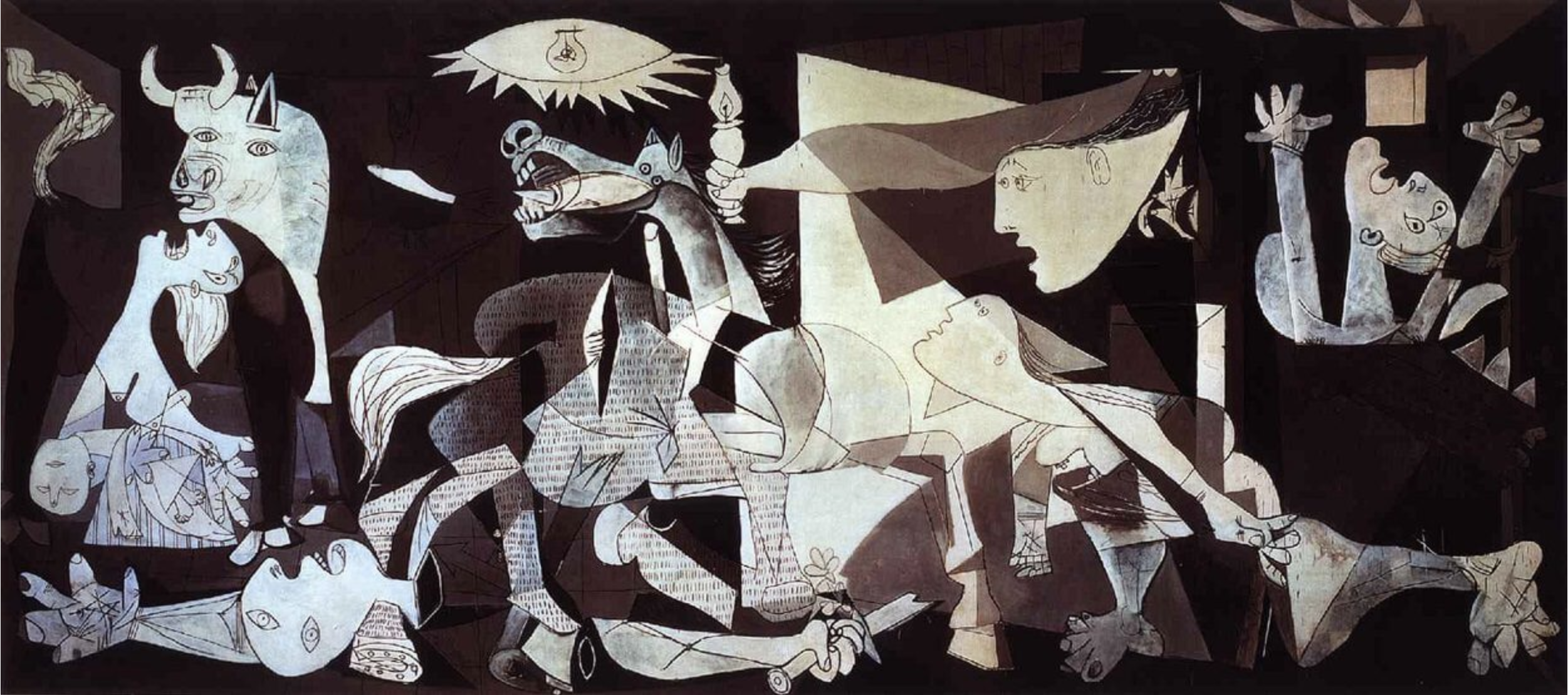
Guernica, Pablo Picasso, 1937
Guernica is enormous–11 ft. tall, 25.6 ft. wide–all the better to consume you into its chaotic imagery of screaming people, a dead baby, a neighing horse, a bull, a room being invaded. Guess what? Picasso painted this as a reaction to the Nazis’ bombing of the Basque village of Guernica during the Spanish Civil War, in their support of dictator Franco. Picasso was Spanish, and he was horrified when he learned of it. Guernica brought worldwide attention to the horrors of what was happening like nothing else had. While he was living in Nazi-occupied Paris during WWII, a German officer allegedly asked him, upon seeing a photo of Guernica in his apartment, “Did you do that?” Picasso responded, “No, you did.” Read more about it here.
The Third of May, 1808, Francisco Goya, 1814
The Third of May, 1808, is also huge–almost 8 ft. by 11 ft. A firing squad is killing unarmed men who are pleading for their lives as blood soaks the ground and dead bodies pile up. Guess what? Goya painted this in response to a horrific event. Napoleon had convinced the king of Spain, Charles IV, that his troops were just passing through on their way to conquer Portugal. It was a trick; instead, he installed his brother as the new king of Spain. On May 2, 1808, hundreds of Spaniards in Madrid rebelled. They were rounded up by Napoleon’s solders and massacred. Goya included Christian symbolism, such as the illuminated poor laborer in a crucifix-like pose with stigmata on his hands, whose submission to the faceless row of soldiers amplifies the inhumanity of the killing. It was recognized it as an anti-war statement and an admonishment of the public for being complicit in events that affect real people. Read more about it here.
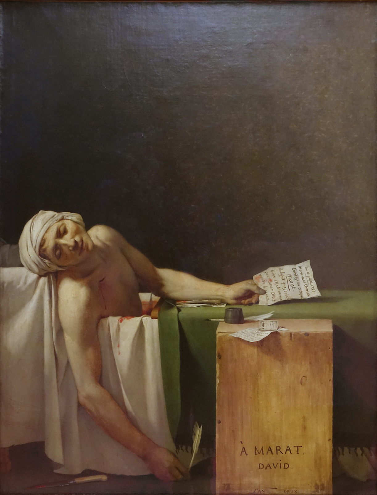
The Death of Marat, Jacques-Louis Davíd, 1793
In The Death of Marat, a man has just been stabbed to death while writing a note in his bathtub, and his bloody, dead body is slumped toward the viewer. Guess what? Davíd was heavily involved in one of the most outspoken rebel factions of the French Revolution. So was his good friend Marat, a publisher. After Marat was murdered in his bath, unarmed and helpless, Davíd immortalized him and their cause by depicting him at death looking like Christ being taken down from the cross. Davíd and his entire club were later executed or imprisoned. Read more about it here.
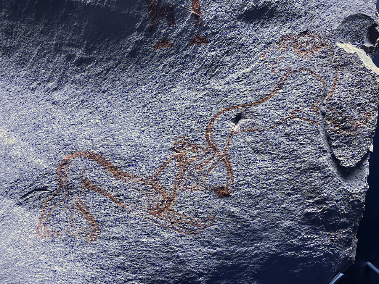
Jackal biting lion, Unknown Egyptian artist, circa 1200 BC
This beautiful little sketch in ink on a hunk of limestone from the time of Ramses II was on display in the “Ramses the Great and the Gold of the Pharoahs” exhibition at the de Young Museum in San Francisco, as an example of drawings that artists made while learning. A jackal is biting a lion’s hind leg, and the immobilized lion is not happy. Guess what? According to the note next to it, historians have pointed out that this was a bold statement against the pharoah, because the lion was always symbolic of power and kingship, often representing the king himself. A lion would never be depicted this way in official Egyptian art. One wonders what prompted the “political cartoon” and whether the artist was punished for it! It proves that art has been used for political commentary for at least 3,000 years.
Zooming back to the present, why do I say “Someday I’ll probably offend you”? Because although I’ve created my fair share of “pretty pictures” and will make more because I like them, too, I also have a social/political conscience that tells me I should use my art to communicate about those issues as ideas emerge. There is no shortage of hot-button topics, and everyone has an opinion. Artists get to express theirs differently.
So far, my art in that direction has been on environmental themes like the human impact on monarch butterflies. That’s not especially controversial, but there are other environmental topics that are. That’s just as an example. Sooner or later I’ll no doubt express something in my art that someone–maybe you–will strongly object to, and will feel compelled to say so, and tell me what an idiot I am for expressing it.
Just don’t tell me “Go back to painting pretty pictures and stay away from politics. Politics doesn’t belong in art.” Because you’d be very wrong, as proved by more than 3,000 years of history. It’s something that art is especially good for.
Now that it’s the very last day of the year, I think it’s safe to say that 2022 was a much better year than 2021 or 2020 for most folks! (Unless you’re heavily-invested in the stock market, or you were a victim of all the layoffs in the tech sector in the second six months.)
It was a busy and productive art year for me:
Exhibited work in 13 juried exhibitions, from local to international
Finished 7 new artworks
Sold 6 originals
Won 4 awards (two 2nd Place, two Honorable Mention)
Taught 3 virtual workshops
Taught 2 local in-person workshops
Taught 2 workshops at the Colored Pencil Society of America convention
Gave 4 presentations to local art groups
Interviewed online by Ann Kullberg and John Middick
Published a tutorial in Colored Pencil Magazine
Exhibited 2 weekends in Silicon Valley Open Studios
Finished my 6th and final year as communications director for the CPSA
Became president of the CPSA
Finished “in the black” (art income vs. art expenses)
Non-art-related, but every bit as important:
Continued to avoid COVID
Retired in July from my 40-year career as a software engineer to transition from part-time to full-time artist
I don’t make New Year’s Resolutions, but I’m looking forward to 2023! Now that I’m a full-time artist, I’m planning to crank out more artworks, and experiment with some additional media (watercolor, acrylic, oil, pastel, airbrush), all of which I gained competency with long ago but haven’t had time to fiddle with in decades. It’ll almost be like starting all over from scratch with them, and I’ll be outside my comfort zone, but it’ll be good to stretch myself without needing to meet anyone’s expectations but my own. You might never see any of my efforts in those other media!
This will be tempered by the amount of time required to be a good president for CPSA–it’s a daily, year-round, volunteer job, more involved than you’d think.
Now that things are getting back to normal in the world as far as gatherings, I’m hoping to teach more workshops, give more presentations, do more travel, and visit more galleries and museums.
There are several groups on Facebook that are devoted to working with colored pencil. They’re very enjoyable to participate in–lots of works-in-progress are shared, lots of questions are asked and answered about techniques, tools, surfaces, framing, photographing, subject-choosing, etc., and the policy is that feedback/criticism is given only if requested. Occasionally, someone in one of the groups asks the other members “Do you do your background first or last?”
I do my backgrounds first, for two reasons:
1) In the real world, the environment was there before the subject was, so it affects all the light, colors, and shadows you see in your subject. Creating that environment (background) first will help you make better color and value choices when you draw the subject.
I learned this as a teenager when I started getting commissions for portraits in graphite. It took months for me to realize why, after I’d spent hours getting the value range right on the face, adding the background suddenly made the face look flat, so I had to go over the face all over again. It was because the initial surrounding sea of white paper was a strong and artificial contrast to the graphite grays in the face–it made them seem darker than they really were. Then adding the background eliminated that sea of white and thereby reduced the contrast, which in turn emphasized that the range of values in the face wasn’t wide enough. Once I figured this out and changed my process to add the background first, this problem went away.
This is why learning to draw in charcoal or graphite first is so valuable–it teaches you the importance of value range, without the added complication of color. In color drawing, the same problems are compounded and can be harder to see and resolve.
2) Business before pleasure. Of course we can’t wait to do the fun part, the subject, so it’s human nature to get right to it. When the subject is done, so is the fun, right? With only the background remaining, it’s a slog to the finish that can’t be over soon enough. Sorry to say, it’s easy to recognize drawings that were done with this approach, even if their value range is good. Too many people spend many hours on the subject, render it beautifully, and then ruin the whole drawing by impatiently rushing through a slap-dash background. I’d show you a few examples, but I don’t want to embarrass anyone! (I did it a few times on those teenage graphite portraits, too, ugh.)
Instead, I practice and encourage working up the background first. Think of it as the prelude to the main event! When you’re finished with your whole drawing, you’ll have a cohesive artwork that displays your skill throughout.